

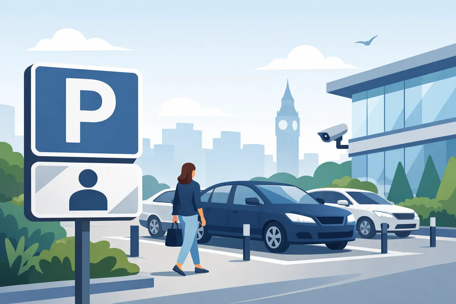
A visitor bay is only useful when drivers can identify it before they park. The best visitor parking signs do more than mark a space: they reduce blocked access, stop staff bays being used by unauthorised vehicles and give guests clear instructions from the moment they arrive.
For facilities managers, landlords, site supervisors and business owners, the right sign is a practical control measure. It helps protect day-to-day operations, supports a consistent parking policy and presents a well-managed site to customers, contractors and delivery drivers. The right choice depends on your layout, the type of visitors you receive and whether the parking area is open, controlled or shared.
What Makes the Best Visitor Parking Signs?
A good visitor parking sign should be understood at a glance, from a moving vehicle and in typical British weather. That sounds straightforward, but signs often fail because the wording is too vague, the lettering is too small or the sign is positioned after the driver has already made a parking decision.
Start with a clear primary message. “Visitor Parking Only” is suitable where bays are unrestricted for genuine visitors. If drivers must report to reception, display a permit or obtain authorisation, say so directly. For example, “Visitor Parking Only - Please Report to Reception” gives a clear instruction without overloading the sign.
The most effective designs use a recognisable parking symbol alongside concise text. A blue and white parking symbol makes the purpose immediately clear, while bold black lettering provides strong contrast. Avoid lengthy paragraphs on individual bay signs. Detailed conditions are better placed at the entrance, on a larger notice board or on a separate parking terms sign.
Durability matters as much as wording. Outdoor visitor parking signs need to remain legible in rain, frost, sunlight and regular cleaning. Rigid aluminium composite is a dependable choice for permanent external locations, while self-adhesive vinyl can work well on smooth internal surfaces, barriers and controlled-access areas. Consider laminated finishes where signs face frequent handling, vehicle wash spray or demanding industrial conditions.
Match the Sign to the Parking Arrangement
There is no single best sign for every site. A small office with three visitor spaces needs a different approach from a hospital, farm shop, industrial estate or managed residential development.
Simple visitor bays
For clearly allocated spaces near an office entrance, a standard “Visitor Parking Only” sign is often enough. Mount one sign at the head of each bay where practical, especially if the spaces sit beside staff or tenant parking. Ground markings can reinforce the message, but they should not be the only identifier. Paint fades, gets covered by leaves or is difficult to see in poor light.
Where visitors regularly arrive outside reception hours, add a directional sign from the entrance. Drivers should not have to circle the car park looking for the correct spaces.
Permit-controlled visitor parking
If visitors need a pass, permit or pre-booked approval, the sign should state the requirement plainly. “Visitor Parking Only - Valid Permit Must Be Displayed” is more useful than simply labelling a bay as visitor parking. It tells the driver what is expected and helps staff apply the same rule consistently.
Be realistic about enforcement. A sign alone does not physically prevent misuse. If misuse is frequent, combine clear signs with permits, a reception process, barriers, staff communication or a managed parking arrangement. The sign is the visible instruction, not a substitute for a workable system.
Shared and multi-tenant sites
Shared car parks need more specific wording. Visitors may not know which spaces belong to which business, unit or building. Use signs that identify the destination, such as “Visitor Parking for Unit 4” or “Customer and Visitor Parking for Reception.” Directional signs at decision points are particularly valuable where several businesses share access roads or parking areas.
On larger premises, consistency is essential. Use the same wording, colours and sign sizes across every block, entrance and bay. Inconsistent signage creates uncertainty and can make enforcement harder to explain.
Restricted access and operational areas
Some sites need visitor spaces to remain clear for operational reasons. A loading yard, fire appliance route, delivery entrance or emergency access point is not suitable for informal visitor parking, even if it looks unused. Use dedicated visitor parking signs to direct drivers away from these areas, supported by separate prohibition signs where parking would create a hazard.
If a visitor route crosses vehicle movements, make the pedestrian route clear as well. Parking control, traffic management and site safety work together. A well-marked visitor bay is only part of a safe arrival process.
Wording That Prevents Arguments
The wording on your sign should reflect the rule you can actually operate. Overstating restrictions can cause confusion, while vague phrases leave too much room for interpretation.
For everyday use, clear wording usually falls into one of three categories: allocation, instruction or restriction. Allocation tells drivers where they may park, such as “Visitor Parking Only”. Instruction explains an action, such as “Visitors Must Report to Reception”. Restriction makes a limit clear, for example “Authorised Visitors Only”. Combining two short messages is often the best approach.
If you use terms and conditions, permit schemes or parking charges, make sure the information is prominent, readable and supported by appropriate notices at the car park entrance. A small bay marker cannot carry all the detail needed for a managed parking scheme. Private parking enforcement is a specialist area, and signage should accurately reflect the arrangement in place rather than relying on generic threats or unclear wording.
Avoid using “fine” unless it is genuinely applicable to your authority and parking regime. Most private land parking arrangements are not the same as local authority enforcement. Accurate, proportionate wording is more professional and more defensible.
Size, Visibility and Placement
The best-designed sign is wasted if drivers cannot see it in time. Position entrance signs where motorists can read them safely before committing to the car park. Place bay signs at the front of the space, on nearby walls or on posts at a practical viewing height.
For a small private car park, a sign around 300 x 400 mm may be suitable for individual bays. Larger sites, faster approach roads and entrance notices often need larger formats. Viewing distance, vehicle speed and surrounding visual clutter should guide the choice. A sign competing with advertising boards, trees or parked vans may need a larger size or a different location.
Check visibility after installation, not just from a standing position. Walk the visitor route and drive through the entrance at normal speed. Can a driver see where visitors should park? Is the sign blocked by an open gate, a skip, foliage or another vehicle? Is it visible in low light? These checks often reveal issues before complaints start.
Reflective material may be worthwhile where visitors arrive early, leave late or use poorly lit parking areas. It costs more than non-reflective material, but it can improve legibility and reduce the need for extra lighting in some locations.
Choose Materials for the Environment
Material selection should be based on where the sign will be used and how long it needs to last. For permanent external signs, rigid boards provide a professional finish and cope well with normal weather exposure. Aluminium composite is widely used for its strength, clean appearance and resistance to corrosion.
Foamex can be a cost-effective option for sheltered locations, temporary projects or short-to-medium-term use. Self-adhesive vinyl is useful for doors, smooth walls, windows and parking barriers, but surface preparation is crucial. Dirty, damp or textured surfaces can shorten its lifespan.
For construction sites, farms and industrial environments, choose a material and fixing method that can withstand mud, vibration, wind and routine vehicle activity. A sign that repeatedly comes loose becomes a maintenance task and may leave visitors without direction at the worst possible time.
Create a Complete Visitor Parking System
A single sign can solve a simple problem. More complex premises need a joined-up approach: an entrance sign, directional signage, marked visitor bays and clear reception instructions. Where accessible parking, electric vehicle charging, parent and child spaces or delivery areas are nearby, each should be identified separately to avoid overlap and misuse.
Review signs whenever the site layout changes. A relocated entrance, new tenant, altered one-way system or additional barrier can make old parking signs misleading overnight. Keep a small stock of replacement signs where damage, refurbishment or seasonal changes are common.
For trade buyers managing several premises, standardising wording and materials can save time when reordering. British-made signage, clear product specifications and quantity pricing also make it easier to maintain the same standard across a portfolio. The Safety Sheep Store can support this practical approach with parking signs suited to straightforward workplace and public-facing requirements.
The right visitor parking sign should leave no doubt about where guests belong, what they need to do and which areas must stay clear. Put that message where drivers need it, keep it readable and review it as your site changes. Think Safety - Think Sheep.
Share:
Warehouse Signs That Keep Workflows Safe
Who Needs Asbestos Warning Signs in the UK?