

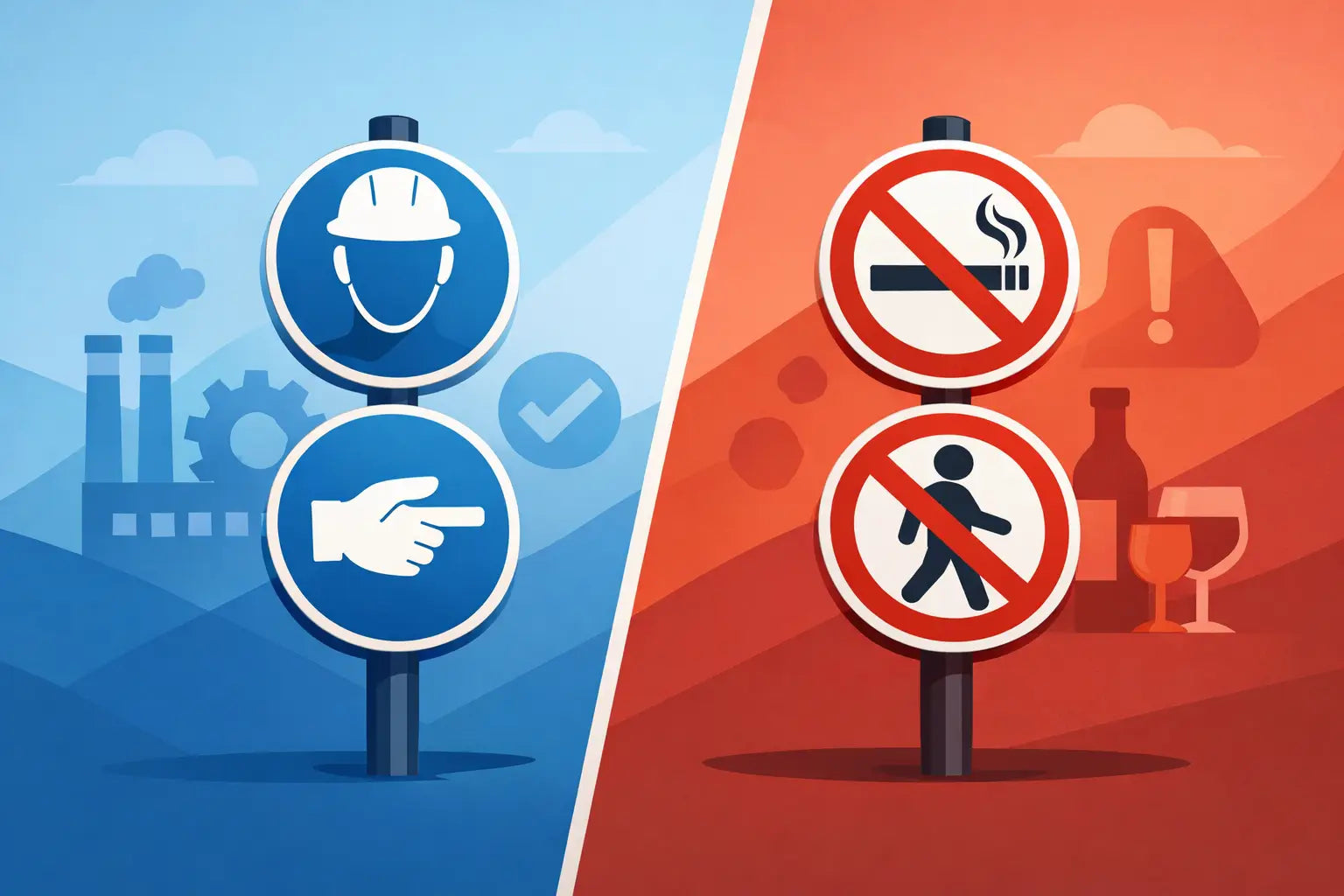
A surprising number of workplace signage problems come down to one basic mix-up: using a sign that tells people what they must do when the real need is to tell them what they must not do. That is the core difference in mandatory signs vs prohibition signs, and getting it wrong can weaken instructions, confuse visitors and leave gaps in your site safety controls.
For busy site managers, facilities teams and business owners, this is not a design detail. It affects how clearly your rules are communicated on a building site, in a warehouse, across a farm, at a school entrance or inside a shared commercial building. If a sign sends the wrong message type, the instruction may be missed altogether.
Mandatory signs vs prohibition signs: the basic difference
Mandatory signs tell people an action is required. They are used where a person must do something to stay safe, comply with site rules or enter an area lawfully. Common examples include Wear Eye Protection, Safety Helmets Must Be Worn and Keep This Door Closed.
Prohibition signs do the opposite. They tell people an action is forbidden. They are used where behaviour must be stopped to prevent risk, damage, unauthorised access or interference with safety measures. Typical examples include No Smoking, Do Not Enter and No Unauthorised Persons.
In simple terms, a mandatory sign instructs positive action. A prohibition sign restricts negative action. Both are essential, but they are not interchangeable.
How to recognise each sign quickly
In most UK workplaces, the fastest way to distinguish these categories is by colour and symbol format.
Mandatory signs are usually blue circles with a white pictogram or text. The blue background signals an instruction that must be followed. If you are telling workers to wear PPE, use a specified route or carry out a required action, this is normally the category you need.
Prohibition signs are usually a black symbol on a white background inside a red circle, with a red diagonal bar across it. That format signals that the depicted action is not allowed. If you are preventing entry, smoking, touching, parking or access by unauthorised persons, prohibition signage is generally the correct choice.
That visual distinction matters because many people process the shape and colour before they read the wording. On a fast-moving site or in a public-facing area, that split-second recognition is part of what makes signage effective.
Why colour coding matters on site
A worker carrying materials through a busy corridor is unlikely to stop and study a wall full of signs. They need to understand the message immediately. Blue says instruction. Red slash says stop. When those visual cues are used properly, compliance becomes easier and your signage system works harder.
If the wrong category is used, the message can feel unclear even if the wording is technically understandable. That hesitation is exactly what you want to avoid in higher-risk environments.
When to use mandatory signs
Mandatory signs are best used where a specific action is required to reduce risk or maintain control measures. PPE signage is the most obvious example, but the category goes wider than that.
You may need mandatory signs where hearing protection is required in a noisy workshop, where staff must wash hands in a food preparation area, or where fire doors must be kept shut. They are also useful in controlled traffic and pedestrian routes, such as Keep Left instructions in warehouses or delivery yards.
The key test is simple: if a person must take an action, not just avoid one, a mandatory sign is likely to be appropriate.
That said, wording still matters. A vague message can weaken a perfectly correct sign category. Compare Footwear with Safety Footwear Must Be Worn. The second version leaves far less room for interpretation.
When to use prohibition signs
Prohibition signs should be used where the main risk comes from an action that must not happen. Smoking near flammable materials is the classic case, but there are many others.
You might need prohibition signs to prevent entry to a restricted plant room, stop members of the public using a service road, prohibit forklift access in a pedestrian zone or block parking in front of emergency exits. They are also common in electrical, machinery and maintenance areas where touching, switching or opening equipment could create immediate danger.
Again, the question is practical: are you trying to stop an unsafe or unauthorised act? If yes, a prohibition sign is usually the better fit.
One area can need both
Many workplaces need both types together. A workshop entrance might display Safety Glasses Must Be Worn alongside No Unauthorised Entry. A farm chemical store might require Protective Gloves Must Be Worn as well as No Smoking. A construction zone may need High Visibility Clothing Must Be Worn and Do Not Enter at different access points.
This is where some buyers hesitate, but there is no conflict in combining them. In fact, using both categories often gives the clearest message because it tells people exactly what is required and exactly what is forbidden.
Common mistakes buyers make
The most frequent mistake is choosing by wording alone instead of by message type. For example, some buyers look for a sign that says hard hats and end up considering several styles without first deciding whether the message is compulsory, advisory or informational. If hard hats are required, the sign must be mandatory, not just generally safety themed.
Another common issue is overloading one location with too many instructions. If every rule is posted on a single board, the key messages can disappear into the background. It is often better to position signs by decision point - at the entrance, on the door, beside the hazard or at the route change - so the instruction appears where action is needed.
There is also the problem of inconsistency across multi-site estates. If one depot uses blue mandatory PPE signs and another uses mixed wording with non-standard layouts, staff and visitors may not respond as quickly. Standardising your signage approach improves recognition and simplifies purchasing.
Compliance, clarity and the real-world test
In UK health and safety settings, signage should support your wider duties to communicate hazards and site rules clearly. A sign on its own is not a complete safety system, but it is an important part of one. The best signage works alongside induction, supervision, markings, barriers and written procedures.
That is why clarity matters more than cleverness. Signs are not there to sound polished. They are there to be understood fast by staff, contractors, delivery drivers and visitors who may have no prior knowledge of the site.
A good rule is to test the sign against a first-time visitor. Would they know what action to take or avoid within a second or two? If not, you may need a different sign, better positioning or a more direct wording choice.
Choosing the right sign for your environment
The right product depends on more than category. Material, size and placement all affect performance.
A small internal office notice may be fine on self-adhesive vinyl. A yard entrance exposed to weather, mud and vehicle movement may need a more durable rigid board. A factory wall with long viewing distances may require a larger format than a door sign viewed at arm's length.
Environment also changes the balance between text and symbol. In mixed-use areas with visitors or contractors, clear pictograms can improve understanding. In specialist workspaces, more specific wording may be useful because the audience already understands the context.
For procurement teams, the efficient approach is to define the rule first, then match the sign category, then select the material and size for the location. That avoids buying a sign that is technically correct but practically ineffective.
A quick way to decide between the two
If you need a fast internal check, ask one question: are we telling people to do something, or stop doing something?
If the answer is do something, you are usually looking for a mandatory sign. If the answer is stop doing something, you are usually looking for a prohibition sign. If the area has both requirements, use both sign types in a clear and organised way.
For busy buyers, that simple split saves time and reduces ordering mistakes. It also makes catalogue browsing easier when you are sourcing across multiple categories, from PPE and access control to fire safety and public notices.
Think Safety - Think Sheep. The right sign does not just fill a space on the wall. It gives a clear instruction at the exact moment someone needs it, and that is what helps keep people safe, sites compliant and operations moving.
Share:
How to Mark Pedestrian Routes Properly
How to Label Fire Doors Properly