Order the wrong sign and the problem is not just cosmetic. On a site entrance, in a warehouse aisle or beside a machine, the difference between mandatory and prohibition signs affects how people behave and whether your signage actually supports safe working.
For duty holders, site managers and buyers, this distinction matters because the two sign types do different jobs. One tells people what they must do. The other tells people what they must not do. That sounds simple enough, but confusion often creeps in when signs are ordered in a hurry, replaced one at a time, or selected by appearance rather than purpose.
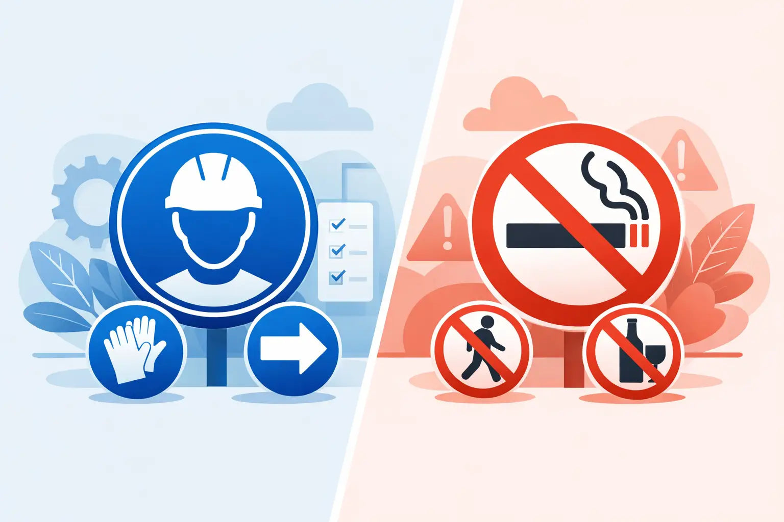
What is the difference between mandatory and prohibition signs?
The clearest way to understand the difference between mandatory and prohibition signs is to look at the instruction being given. A mandatory sign gives a positive instruction that must be followed. A prohibition sign forbids an action that could create risk, damage or non-compliance.
In practical terms, mandatory signage says things like Wear Eye Protection, Keep This Door Closed or Wash Your Hands. Prohibition signage covers messages such as No Smoking, No Unauthorised Entry or Do Not Use Lift In Event Of Fire.
Both are safety signs, both are widely used across UK workplaces, and both support safer behaviour. The key difference is direction. Mandatory signs require an action. Prohibition signs ban an action.
How to recognise each sign quickly
In most workplaces, people do not stop and study every sign in detail. They scan shape, colour and symbol first. That is exactly why using the correct category matters.
Mandatory signs
Mandatory signs are typically blue and white. They are usually circular, with a white pictogram on a blue background. This design signals an instruction that must be obeyed.
Common examples include eye protection signs, hearing protection signs, hard hat area signs and hand washing notices. In many cases, these signs appear where PPE, hygiene controls or specific operating procedures are required.
Prohibition signs
Prohibition signs are typically red, white and black. They are usually circular with a red border and diagonal bar across the symbol. This visual format signals that an action is not allowed.
Typical examples include no smoking signs, no mobile phones signs, no pedestrian access signs and no forklifts signs. These are used where behaviour needs to be restricted to prevent danger, contamination, disruption or unauthorised access.
If someone can identify the sign type from a distance, the message lands faster. That matters on busy sites, in shared spaces and anywhere visitors may be unfamiliar with local rules.
Why the difference matters in real workplaces
Choosing between these sign types is not just a design decision. It shapes the instruction you give and how easy it is for people to comply.
Take a workshop entrance. If the real risk control is that anyone entering must wear safety goggles, a mandatory sign is the correct fit. A prohibition sign such as No Entry Without Eye Protection may still point people in the right direction, but it frames the control differently. In some settings that may be acceptable, but in others a direct mandatory instruction is clearer because it tells people exactly what to do.
Now take a fuel store. If the key rule is that smoking and naked flames are banned, prohibition signs are the natural choice. A mandatory sign saying Extinguish Cigarettes could support the same risk control, but it is less direct and less standard for the hazard.
This is where buyers often benefit from stepping back and asking one question: are we requiring an action, or stopping an action? That one check usually leads to the right sign category.
The role of mandatory signs in compliance
Mandatory signs are especially useful when a control measure depends on people taking a specific step. PPE is the obvious example, but not the only one.
They are also common in food preparation areas, washrooms, laboratories, plant rooms and access-controlled environments where behaviour has to match the task or setting. If hand washing is required before entry, if protective footwear is compulsory, or if a fire door must be kept shut, a mandatory sign makes that obligation clear.
The advantage of this sign type is precision. It removes guesswork. Instead of implying a restriction, it states the required action plainly.
That said, clarity still depends on placement and wording. A mandatory sign hidden behind an open door or mounted too high to read will not help much. The best results come when signs are visible at the point of decision, not several metres too late.
The role of prohibition signs in controlling behaviour
Prohibition signs come into their own where the main risk is caused by an action that should not happen at all. Smoking near flammables, entering a restricted area, using a phone where distraction creates danger, or bringing vehicles into a pedestrian route are common examples.
These signs are often the clearest choice where boundaries need to be obvious. They are also useful in public-facing environments because the message is easy to grasp quickly, even for visitors, contractors or delivery drivers who do not know the site.
In some cases, prohibition signage also helps protect equipment, products or hygiene standards rather than people alone. A no food or drink sign in a production zone, for instance, supports contamination control as much as personal safety.
As with mandatory signs, the message should match the real-world risk. If the issue is simply that only trained staff may operate a machine, a general prohibition sign may need to be supported by additional wording so the instruction is not too broad or vague.
When both sign types are needed together
Many workplaces need both categories side by side. That is not over-signing if each one serves a distinct purpose.
A good example is a construction entrance. You may need a prohibition sign such as No Unauthorised Entry and, at the same location, mandatory signs requiring hard hats, high-visibility clothing and safety footwear. One set controls who can enter. The other controls how entry must take place safely.
The same applies in farms, factories, schools, commercial kitchens and maintenance areas. A single location can involve restrictions and requirements at the same time.
The trade-off is visual overload. If too many signs are clustered together with no clear hierarchy, people stop noticing them. It is often better to group signs logically and remove outdated or duplicated messages than to keep adding more.
Common mistakes when ordering signage
One of the most common mistakes is choosing a sign based on familiar wording rather than the correct category. Another is replacing a damaged sign with something close enough, even if it changes the instruction.
There is also a tendency to rely on text alone. Symbols matter because they improve recognition speed, especially in mixed workplaces where literacy levels, visitor familiarity or first language can vary.
Size is another issue. A sign that is technically correct but too small for the viewing distance may fail at the exact moment it is needed. Material choice matters too. Indoor self-adhesive labels may not hold up in exposed yards, washdown areas or agricultural settings.
For larger sites and multi-site buyers, consistency is worth paying attention to. Mixed sign styles can make a site look unmanaged and may reduce confidence that controls are being maintained properly.
Choosing the right sign for the job
When selecting signage, start with the hazard and the behaviour you need to control. If people must do something, look at mandatory signage. If people must not do something, look at prohibition signage. If both apply, use both clearly and avoid muddled wording.
Then consider where the sign will be installed, who will see it, how far away it needs to be read and what material will suit the environment. A factory floor, farm gate, office corridor and public car park all place different demands on durability and visibility.
For procurement teams and facilities managers, speed matters too. Buying from a supplier that offers UK-compliant, British-made signage, dependable stock coverage and same day dispatch can make replacement and rollout much easier, especially where urgent compliance gaps need closing. Think Safety - Think Sheep.
Difference between mandatory and prohibition signs in day-to-day use
In day-to-day operations, the difference between mandatory and prohibition signs comes down to the behaviour you are trying to shape. Mandatory signs support compliance by directing the right action. Prohibition signs reduce risk by stopping the wrong one.
Neither is better in absolute terms. It depends on the task, the location and the control measure behind the sign. The best signage schemes use both thoughtfully, keep messages consistent and place them exactly where decisions are made.
If a sign leaves room for doubt, it is probably the wrong sign, the wrong wording or the wrong position. Clear instruction is what keeps people moving safely, sites looking compliant and problems from becoming incidents.
Before you place the next order, read the message as the person on site will read it. If they can tell instantly what they must do, or stop doing, you are on the right track.
Share:
Flammable Storage Warning Signs Explained
Fire Door Signs: What UK Sites Need